UX/UI DESIGN
UC Davis Parking
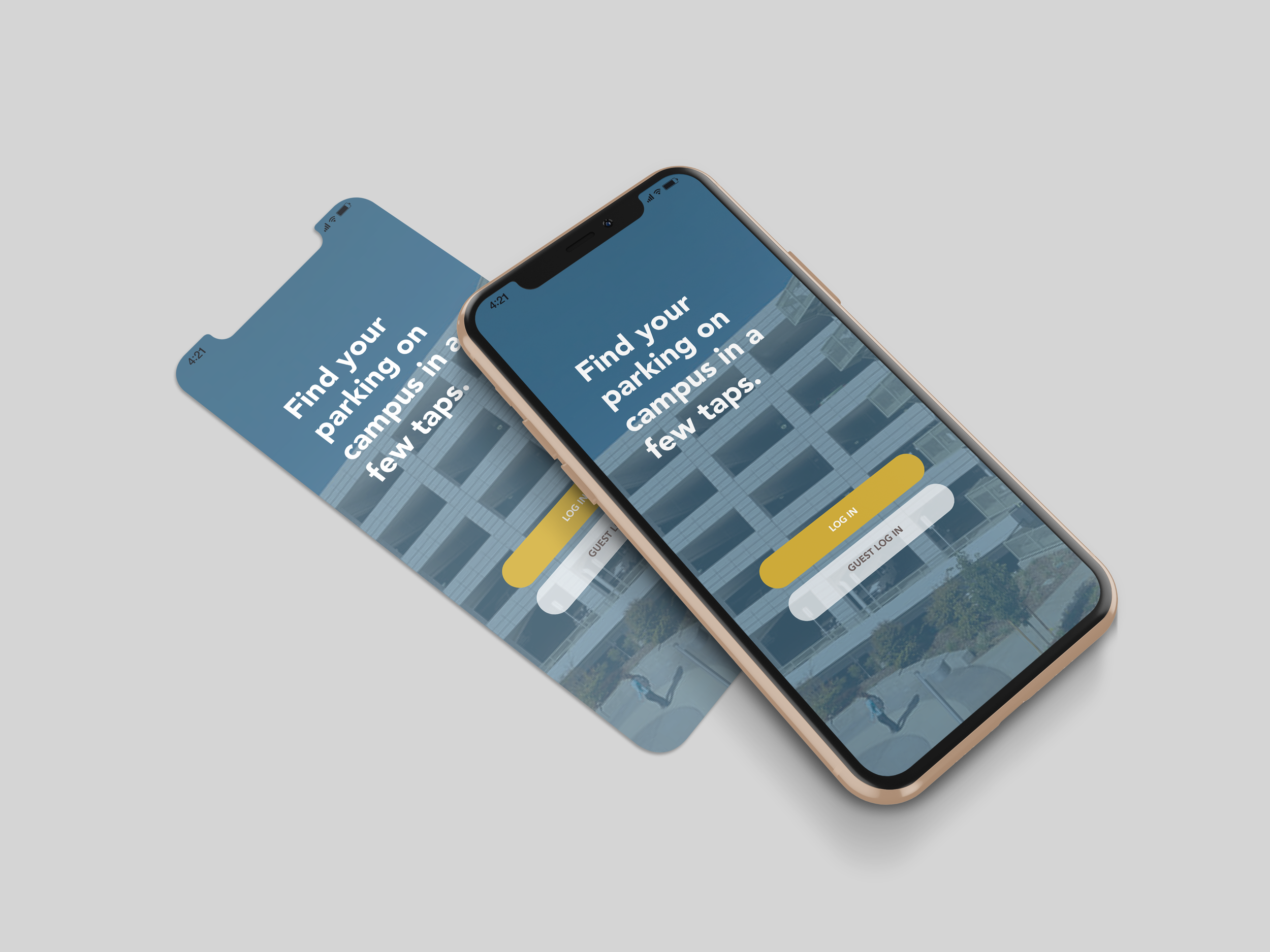
UCD Parking is an app concept designed to address the equity problem of impacted commuter students/staff and students/staff who drive to school. The purpose of the project is to provide an app that would help the user find parking on campus in a matter of seconds - by displaying the number of spots available in each lot before the user goes to the location.
The target audience are commuter students/staff, as well as students/staff who drive to campus on a daily basis.
The prototype was designed to allow the user to complete 3 tasks within the app: 1) Logging on and browsing for real time parking availability, 2) Customizing the user’s personal account and parking list, 3) Making a forum post.

Task 1
Logging on and browsing for real time availability on spots.
During this task, users will be able to see at a glance how many spots are available at each specific lot depending on their location/miles radius in real time. When the user taps the GPS Icon, it will open the lot location in their mobile device’s default navigation app. (Apple Maps in prototype).
Task 2
Customizing your MY PARKING List.
Users can customize their own list as a shortcut key for fast and easy access to their most frequently visited lots. For this task, users can go to MY PARKING, tap EDIT, checkbox the desired lots, and hit DONE for their customized list.
Task 3
Making a forum post.
Users can browse the app’s forum for questions they may have/discuss situations about TAPS/Parking. The user can make a post by hitting the Add icon, typing in their question, and tapping POST. The post will immediately appear after posting. The user can also flag posts to get notifications whenever someone comments on it.
User Testing Usability Report
I put my prototype to the test by conducting a few User Testings. I asked my peers to review the app for me, and to see if they could complete the 3 tasks I aimed for them to complete when designing the app.
The users I tested were my old college roommate, my sister who commutes to her community college, and my other sister who has graduated from UC Davis a few years back. The three testers ranged from 22-29 years old, reports that they have a fair amount of experience with apps and interacting with interfaces.
For the first task, all three of them seemed to have executed it just fine, with logging on through taps and buttons, and then navigating to the home page that displays the amount of spots available at the lot. They all answered 0, and reported that this was very usable.
For the second task, they all found the MY PARKING tab on the bottom of the page with the navigation bar, and tapped it to see that a list has not been created yet, and they tapped EDIT to complete the task. They did say the checkboxes makes it very easy to follow along. Some things they reported was to maybe have the words larger.
For the final task, they all seemed to have done it fairly fast, and navigated to the FORUM tab to do this task. They reported that perhaps to have an editable feature for the tap, and to display a keyboard since it doesn’t really show in the prototype. My UCD alumna sister mentioned that maybe I should connect the app with TAPS, and have options to pay for parking tickets/buy a parking pass.


